
Over The Last couple weeks I designed This Typeface. Its called Skinny Dip and is a style of lettering that I have been wanting to do for Quite some time. I designed 3 weights and the one above is the skinny version of the face.

This is the Regular weight face that I designed and based the skinny, and the bold on.

Here is The Bold version with filled counters and parallel lines. Some Characters are more successful than others and it still needs some work but I am pleased with the results and hope to use this face in some future designs.
 Over The Last couple weeks I designed This Typeface. Its called Skinny Dip and is a style of lettering that I have been wanting to do for Quite some time. I designed 3 weights and the one above is the skinny version of the face.
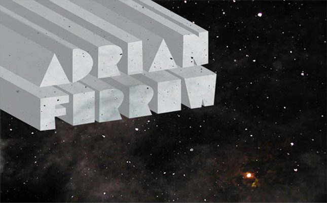
 This is the Regular weight face that I designed and based the skinny, and the bold on.
 Here is The Bold version with filled counters and parallel lines. Some Characters are more successful than others and it still needs some work but I am pleased with the results and hope to use this face in some future designs.
No comments:
Post a Comment