So last week I was asked to illustrate the possible cover for this weeks(June 10) eye weekly. I was super excited at the opportunity and jumped at the chance to grace the pages of this awesome Toronto publication. The would be cover (above) Is for a band called Pavement, whom I've been a fan of since I was a wee pup. So the commission was a dream job basically and I got a lot of freedom to do what I wanted for the cover. The only down side is that there was no guarantee that it would be the cover image.
As of now I haven't actually seen the cover but I was told that my cover images was not selected:( but I am told that it did make it into the main article for the band:)

I was also asked to make a few spot illustrations to be used with the article and this is what I came up with.

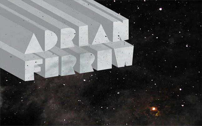
The art director liked the type treatment I made for my web and blog page so worked with those forms and added elements that are reoccurring in the cover art as well as my somewhat signature adornment.
Like I said I haven't seen the paper yet but I believe the type made it to the cover sans the elements and decoration. I can't wait to see the paper and I hope that some people get to check it out.
 After work this Wednesday I jumped on my bike and rode up to queens park for the Friends With You, Installation.
 I've loved the work of these Miami based artists for a very long time, So I was very pleased to finally see there amazing work in person.
 Their work is also on Display at Narwhal gallery and it is worth checking out. There are also a few more installations by FWY, peppered around Toronto which I hope to search out in the next few days. Soooo good!


